Wednesday, 18 January 2012

Wycoller Village and Country Park

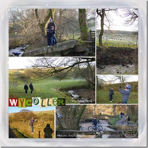
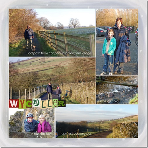
A Sunday afternoon visit to Wycoller village near Colne and its surrounding country park is documented in these three pages.  Although it was very cold to say the least we had a lovely afternoon, even including a picnic!

Wycoller15b

I have used the very talented, Cinzia Loosemore's, Everyday Life graphic style templates for this project.  I really like them.

Wycoller2-copyb

I like the clean unfussy look of these pages, it seems to suit the photos.

Wycoller3b

The background paper is from Happy Holidays mini kit by Emeto Designs available at After5Designs.com.  The alpha is one I've had for ages from Designer Scrpbook Place a freebie by Nicole Young.

Kathleen.

Thursday, 24 November 2011

Autumn Pages

I love autumn, who doesn't?  Maybe that's got something to do with why I've really enjoyed creating the following layouts.

AutumnDevon2011-copyb

First up is a layout with photos of our autumn holiday spent down at the caravan in Devon.  We had a lovely time and packed quite a lot into our week.  I wanted this page to show all the different stuff we were able to do  which included breakfast on the beach even though it was the end of October.

  • Credits: Paislee Press Plate No. 27 a freebie from www.oscraps.com
  • Leaves  - Everyday Inspiration 10-25-09 by Katie Pertiet at www.designerdigitals.com, a freebie
  • Worn Strips No. 4 by Lynn Grieveson at Designer Digitals.
  • Alpha - Cinzia Loosemore Thankful For You Kit at www.oscraps.com
  • Simply Boy Kit (I can't remember at the minute where this came from but I'll come back with the details when I find them!)

CraggVale30b

I love these photos taken in Cragg Vale when Caroline and I took the boys for a little walk through Cragg Vale at the end of last month.

Trev&Chas-copyB

This page is my latest creation and it's one of my favourites.  The poem is a perfect one for parents and children and these photos were just perfect for the poem.  All the photos were taken a couple of weeks ago on a Saturday morning in Uppermill Park when Trev took his little boy, Charlie, by the hand and played on the stepping stones across the river.

  • Credits:
  • Been There Template by Katie Pertiet at Designer Digitals
  • Elements from Simply Boy Kit, as before.

Kathleen.

Sunday, 9 October 2011

Nicholas

These are a few pictures of Nicholas I took recently when he was playing in my garden.  I particularly like the main photo and wanted to build a layout around it.  I love the technique of blending a photo into the background and I was able to employ that technique in this layout.

Nicholas9Sep11-copyb

The template I chose is My Boy, a freebie, from Little Dreamer Designs.  Once again I used Little Layette Kit by Katie Pertiet of Designer Digitals to decorate the page.  Lastly the background page is from a kit I purchased this week - Simply Boy by Cinnamon Designs available at After Five Designs.  I'm looking forward to using this kit more Simply Boy on my next lay out.

Kathleen.

Monday, 3 October 2011

Charlie the Nursery School Boy

It's hard to believe but my youngest grandson, Charlie, he's only three, started Nursery School a few weeks ago.  He attends for three hours each morning and has taken to it like a duck to water - thank goodness!  You see, it's my job quite often to take Charlie to Nursery and pick him up and because he likes it it's a very easy job.  For some parents though it's not so easy.  There are a couple of children who have been crying because they don't want to go in.  I feel so sorry for them and their parents.

ChasNursery2-copyb

Anyway, here's the digital scrapbook page I've made to remember this big step in this little boy's life.   Doesn't he look a little cutie in his "Don't you look like a big boy?" school uniform?

I struggled a lot with this layout.  I just couldn't get the look I wanted.  In the end I went surfing for inspiration and bought a new kit.  Teacher's Pet Kit by Kristin Aagard at After Five Designs and I love it.  It's a huge kit with tons of fun stuff in it.  Lucky for me the A5D gallery had plenty of pages posted using this kit and I soon found the inspiration I needed.

Kathleen.


Sunday, 7 August 2011

Lazy Sunday Afternoon.

I'm having a quiet lazy day today.  It has rained more or less all day so no incentive to go outdoors.

Newquay2011-copyb

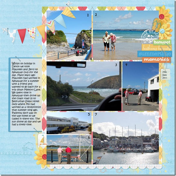
Instead I've been doing some digital scrapbooking in Photoshop Elements and here is the page I've made.  This layout records the day in Newquay, Cornwall William and I spent with my sister and brother in law on our holiday together in June.

Credits:  Katie Pertiet - Template Inspiration 7.31.11 and various elements all available at Designer Digitals.   Kristen Aagard - On a Sunny Day Kit available at After 5 Designs.

Kathleen.

Wednesday, 20 July 2011

Charlie Chops the Little Monkey!

This page tells the story of the day Charlie was a little monkey.

Charlie-and-books-copyb

Charlie is constantly told how to look after his books and he knows to treat them with care and not purposely damage them.  Whilst at my house just recently though he was definitely not looking after his books properly.  Not an earth shattering event by any means but scrapbooking is for documenting the everyday not just the important days.

I've used Charlie Chops in the title because if you ask Charlie what his name is he invariably says Charwie Chops.  I think that's come from his parents and when he says it it sounds really cute!

Here I've used Lynn Grieveson's Sock Monkey Kit; papers from Kevin and Amanda's, Fall Kit; stitching from a Katie Pertiet template, all available at Designerdigitals .com.  The title font is a free font, Quick End Jerk by Vic Fieger at Fontsquirrel.com and the journalling is Kristen ITC a PSE5 font.

Kathleen.

Wednesday, 8 June 2011

Little Doggies.

George and Nicholas were having fun playing at being dogs here the other day.  I snapped some photos and here they are in a layout already!  I think I've excelled myself with the speed these photos have found their way onto a page.

G&NDogs-copyb

Credits:  Lil Layette Kit - Katie Pertiet at Designer Digitals; Brushes and photo frame - Cinzia Loosemore at Oscraps; couple of elements (the clock, and Believe definition) from Creative Wings Designs.

I'm learning how to use brushes properly at the moment. On this layout the brushes are the faded details popping out behind the photos.  They add depth and a little more interest to the page.  I'm constantly dropping in on Kayleigh Wiles' blog at the moment for tips and tricks. I like her scrapping style and easy way of writing instructions.

I'm off to Photoshop Editor now I've got another page to start.

Kathleen.